Communication Intervention, Part II: I can see clearly now the text is gone.
Some art and science behind the infographic.
By Sarah Coe
A picture really is worth 1000 words. Our eyes and brains can process an image in as little as 13 milliseconds. The impact and usefulness of images isn’t really news to us. Early mankind and our predecessors recognized the value of imagery some 40,000 years ago. Before Facebook, Pinterest and Instagram, humankind used imagery for communication, entertainment and even as magical offerings for an increase in food sources.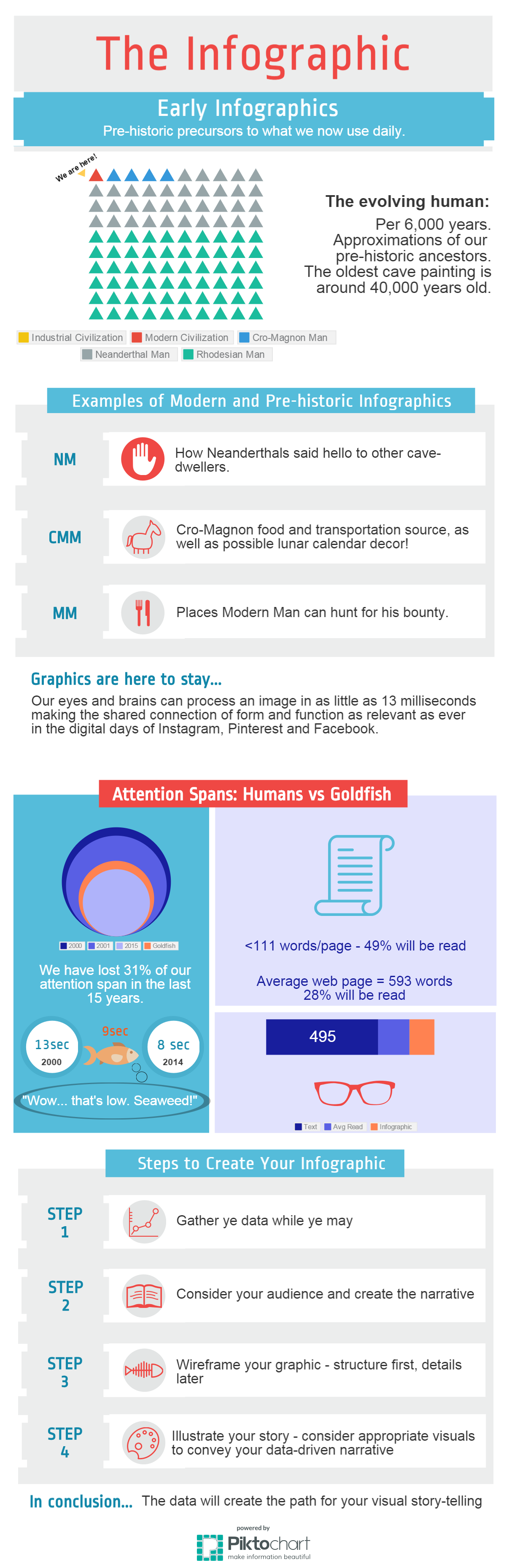
The shared connection of imagery as both form and function is as evident in ancient cave paintings as it is in the recent popularity of infographics used to convey complex data in a way that people can quickly grasp.
Why have we so heartily embraced this cousin of prehistoric communication? One cause may be that in the last 15 years we have lost four seconds off of our average attention span, landing us just behind the goldfish. Yes, you read that correctly. Our 8-second attention span is less than the 9-second span of a goldfish….In fact, I’ve already forgotten the topic of this article and you probably stopped reading 100 words in, only having read roughly 50% of that. What was I saying? Oh yes…
If you are on the higher end of the attention-span bell curve and are still with me, I’m going to dive into the world of infographics – otherwise known as “how I can get you to understand what I’m communicating before the goldfish races past.” Infographics are so easy that cavemen could do them! And they did, as was earlier mentioned. We won’t be using ours to increase our hunting bounty today but, if done and delivered well, we could increase our readership, increase our brand recognition and potentially even increase dollars for our most important initiatives.
In fact, if I were to truly demonstrate the effectiveness and value of an infographic communication versus plain text, I would have done this entire article as one infographic… and I did. You can find it here.
I’ve created my infographic using a platform called Piktochart. There are several other options including Vizualize, Easel.ly and Venngage. Most offer you limited capabilities for free with the option to upgrade, baby, upgrade! The investment is usually nominal and may be worth it to you to remove watermarks from your graphic (picture editors also work for that), enjoy a greater variety of template selections, and access more editing and publishing features.
It is important for us to remain adaptable with our methods of communication. After all, we used to mock cavemen for their simple natures, yet here we are – using images regularly to convey important meaning. I even read an article recently that said infographics may soon be on their way out (I think it was written by a goldfish). Whatever the next hot topic of communication may be, our attention spans do not show signs of rebounding any time soon. Infographics can be a useful tool in our communication toolkits for some time to come.
© Life Cycle Engineering, Inc.