Help Your Reliability Activities Earn the Respect They Deserve
By Bill Barto, ASQ CRE, CMRP
As appeared in RxToday
Recently, I led a discussion panel on the topic of reliability and maintenance. The conversation eventually settled on the issue of demonstrating the value of reliability engineering and asset management in general. One young reliability engineer stood up to express his desire to learn a way to show the executives in his company that they should continue to support his group’s efforts. The group in attendance offered many great examples of personal success. My goal for this article is to share a few thoughts and provide some examples of how to get your reliability activities noticed.
Unfortunately, it is human nature to appreciate reactive efforts (fixing the problem after it has happened) more than proactive ones (stopping the problem before it could have happened.) If you need an example, just ask a child whether they would rather be a fire fighter or a fire marshal. Even a child knows that you get more attention by putting out the fire than you do for eliminating all ignition sources. We have all probably experienced dismay at the lack of recognition for our efforts to find and control potentially disastrous failure modes before they occurred, while the plant manager showered the overnight crew with praise after locating and troubleshooting a relatively benign issue. I recently asked a number of maintenance and reliability professionals the question, “What type of maintenance work gets more recognition (awards, 'atta-boys', pats on the back, etc.) in your facility, plant or location?” The following chart shows the answers.
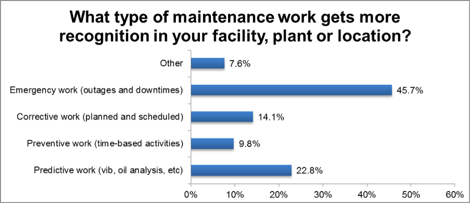
As you can see, almost half of the 92 respondents noted that emergency work gets more recognition in their areas. While this is not as bad as I might have expected, it does show that typical reliability activities are not equally recognized.
I do not blame the company leaders for recognizing the “firefighters” for doing their job. After all, being able to return equipment to an operational state is very important and a task that is not to be undervalued. I am only trying to point out that showing the same level of gratitude to the individuals that are preventing the “fires” from starting in the first place is only fair. Getting the same level of appreciation requires you to make sure that your manager is aware of your efforts.
I believe that your manager is looking for reasons to give you accolades. If you pick up any business magazine or journal, you will see numerous articles about the necessity for managers to recognize their employees. What you will have more trouble finding is articles about the importance of giving your manager a good reason to recognize you. How can you expect a manager to give you the kudos you deserve if you do not present him with the reasons why you deserve the recognition? Keep in mind that this is really about reporting your true value to the company, not about getting free movie tickets or a certificate to place on the wall.
Demonstrating your value is more than an activity completed right before your performance evaluation. Consider making value demonstration a constant activity. Always be on the lookout for opportunities to inform your leaders about the activities that you are completing and the value that they contribute to the company.
Consider Your Audience
One of the best methods to get your reliability activities noticed is to ensure that you are speaking the same language as your intended audience. When I say language, I mean the terms, metrics and measures used to quantify the potential improvements. For example, if you are promoting the fact that you have the ability to increase the availability of assets in your control by some percentage by reducing the number of downtimes, find a way to describe that rise in a unit of measure that your targeted recipients will appreciate. Do not expect the executives and leaders in your company to interpret your reliability metrics, if those metrics do not directly support business objectives. You will have much better luck getting the credit you deserve if you make your improvements as easy to understand as possible.
At a company I used worked for, the most important measure of value was customer throughput. In our situation, there was no direct financial gain from increasing equipment reliability. Therefore, instead of expressing my improvements and projects in terms of availability percentages and MTBF increases that were difficult for my leaders to understand, I explained the results of my efforts as an increase in the number of customers served. I had no doubt that my direct leader and the leaders in the other departments clearly understood the value of the work I performed. This quickly became the common language during project reviews and status updates. It did not matter where the individual worked or what their background was. They understood that increasing guest throughput was important and all efforts toward that goal were valued and appreciated.
Show and Tell
After finding the right language, find a method to demonstrate the improvements. I have found using typical reliability growth methods to be a great graphical method of showing value to your leaders. Most users create reliability growth models during the testing phase of product development, but this type of plot can demonstrate an improvement in reliability during any period. Instead of turning this into a tutorial on reliability growth testing, I will show one quick method of recording and visually displaying your results.
One of the easiest and most visually engaging methods of displaying reliability improvements is the Crow-AMSAA plot. The basic premise is that comparing the downtime data from before your reliability improvements to the downtime data from after the improvements allows conclusions to be drawn. These conclusions are in the form of total number of downtimes avoided, total increase to production uptime, total number of additional products made or customers served, etc.
Advantages:
- Special software is not necessary. The example in this article was made using Excel.
- The graphical presentation of the results is easy for anyone to understand.
Limitations:
- Downtime records from before and after the improvement are necessary. The accuracy of the results will improve as more records are included.
- Due to model assumptions, the system must be complex. This model works better for systems or production lines, not individual pieces of equipment.
- Production rates and operating time duration must be consistent throughout the entire data set.
In the example shown, suppose the reliability activity that I wanted to make my leader aware of occurred on 6/1/10. To make the plot, I need dates and lengths of downtime work orders from before and after the activity. For creating this example, I generated 39 random work order dates, 20 before the activity and 19 after. The double line border in the chart (Table 1) represents the separation between the two sets of data. After creating the other two columns in the table, I plotted each point onto logarithmic axes with the cumulative number of days between downtime work orders on the x-axis and the cumulative number of downtimes on the y-axis (Figure 1). For visualization purposes, the data points in blue are from before the reliability improvement and the ones in red are from after the improvement. You can see in the graph that each set of points is linear along a different slope. The slope of each line (the exponential in the trendline equation) is an indication of the rate of downtime occurrence. If the slope is greater than one (as it was before the reliability activity), the conclusion is that the downtime rate is accelerating and the reliability is decreasing. If the slope is less than one (as it was after the reliability activity), the conclusion is that the downtime rate is decelerating and the reliability is improving. This is an important deduction that on its own indicates that the reliability activity was successful.
The indication is a helpful guide, but a numeric measure using the language you choose is much more useful. To go further and calculate an amount of increase, I plotted the point that represents the number of downtimes expected to have occurred without the improvement activity. In this example, I did that by substituting the cumulative number of days between the first and the last work order (432) into the equation for the trendline for the downtimes before the activity [0.0402*(432^1.297) = 105]. The result is that without the reliability activity, the model predicts that 105 downtimes would have occurred by April 3, 2011. With that information, I can then determine the number of avoided downtimes resulting from my reliability activity. In this case, the difference between downtimes without and with the improvement is 67 (105-38).
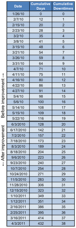
Table 1
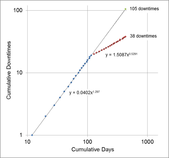
Figure 1
Give It to Them Straight
At this point, the plot is finished and contains all the information that you need. However, before you run down the hall and declare your victory, I need to offer a word of warning. Nothing will damage your credibility and invite others to dismiss your findings faster than presenting a plot containing technical jargon or confusing notation. More importantly, you are missing the opportunity to show your audience that you speak their language. Think of the visual image you are going to present as an extension of the language. While there is nothing technically wrong with Figure 1, it does not tell the story in a way that I want it to. By sticking with only the details that add value or tell the story, you are showing them that you understand the business goals of the company and have the ability to show your activities in a way that meets those goals. Once you understand how your activity can support the business, it is time to produce your results in those terms.
If you choose downtime savings as your language, you could stop here and create your final presentation. In this case, I am looking for something more. Imagine that the average length of a downtime work order before the reliability activity was 45 minutes. With this information and the number of downtimes avoided, the total amount of time returned to production is 3015 minutes (45 minutes * 67 downtimes). This improvement in production time resulted over the span of 306 days (6/1/10 – 4/3/11). The result is an additional 9.85 minutes of production time per day of operation (3015 minutes / 306 days). This may not seem like a lot, but depending on your production rate and other metrics, this could be a significant increase for the remaining life of the system of production line. In this case, I assumed the customer throughput metric was 30 customers per minute. The result is the ability to serve an additional 296 customers each day (9.85 minutes * 30 customers/minute). At this point, I have converted the original findings of improvement by comparison of the slopes into a metric that supports the company’s business objectives. A new and improved presentation of the plot is in Figure 2.
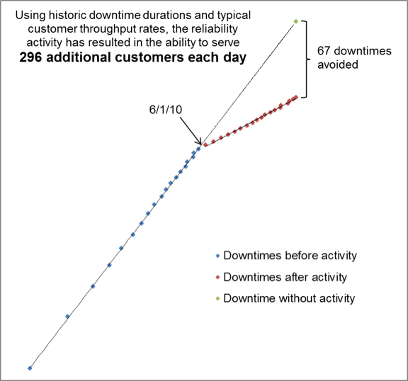
Figure 2
Be Bold
Finally, be bold. Look for opportunities to shine light on your work and achievements. Do not waste the chances you have by using the wrong language or expressing things in terms and metrics that do not support the business objectives of your company. If you do not know the business objectives, make connections with the individuals in your company that do. Let them know what you are trying to do and they may even surprise you with some additional information. Even if you do not use the techniques I shared in this article, find ways to exceed the status quo when it comes to reporting and make your leader take notice. Remember what Dizzy Dean said about his prediction that he and his brother would win 45 games for the St. Louis Cardinals during the 1934 baseball season, “It ain’t braggin’ if you can back it up.”
The following steps show how to create Table 1 and Figure 1 using Excel.
- Create a table and place the words “Date”, “Cumulative Days” and “Cumulative Downtimes” along the top row.
- Starting in the first column of your table, list the dates of your downtime or emergency work orders (1/4/10, 1/8/10, 1/17/10, etc.)
- In the next column, calculate the number of days between each date and the earliest date in the first column (0, 4, 9, etc.)
- In the last column, place a sequential list of numbers starting at 0 (0, 1, 2, etc.)
- Create a scatter plot of the values in the second and third columns using only the data from BEFORE the reliability activity. The second column data should be along the x-axis while the third column should be along the y-axis.
- Convert both axes of this chart to logarithmic scales.
- Create another scatter plot on the same chart of the values in the second and third columns using only the data from AFTER the reliability activity. Use the same convention for x- and y-axes.
- Fit a Power trendline to both sets of data separately and display the formulas on the graph. The format of the trendline equations should be y=ax^b.
- Calculate the predicted number of downtimes had no activity taken place. Do this by plugging the last number from the second column into the trendline equation from BEFORE the reliability improvement.
- Plot this new point onto the same graph and extend the trendline to this new point.
- Label the axes and points.
© Life Cycle Engineering, Inc.

For More Information
843.744.7110 | info@LCE.com